Grandparents University (GPU) is a cherished program by the Wisconsin Alumni Association (WAA) that unites alumni and their grandchildren for a unique learning adventure on the UW–Madison campus. For the rebranding of GPU, we took inspiration from the iconic Crest logo of UW–Madison, incorporating the new Well Red Bucky sculpture, distinct typography, and motifs unique to WAA.
ROLE
Lead Brand and Event Designer
TEAM
Collaborated with the Senior Designer, the Marketing Team, and the Alumni Relations & Engagement GPU Program Team.
DIVISION
Alumni Relations and Engagement, Wisconsin Alumni Association
DESIGN PROBLEM
The Grandparents University brand lacked a consistent identity because it was reinvented yearly. While participants cherished the distinct T-shirt designs annually and kept them as mementos, the frequent changes in the brand’s appearance resulted in inconsistencies and required significant effort to implement the new designs across printed and digital materials.
DESIGN SOLUTION
To address the design problem, I collaborated with the teams to develop an evergreen brand for GPU. I designed a GPU logo, set typography standards, and defined an illustration style that would remain constant every year. I specified which communication and promotional materials should maintain a consistent design while allowing some items to showcase unique interpretations of the GPU brand annually. This approach provided a good balance between consistency and variety, which helped to reduce the overall workload significantly.
BRAND
Reimagined the UW Crest for Grandparents University, integrating the Well Red Bucky, dynamic diagonal motifs, and approachable iconography.
Brand Redesign
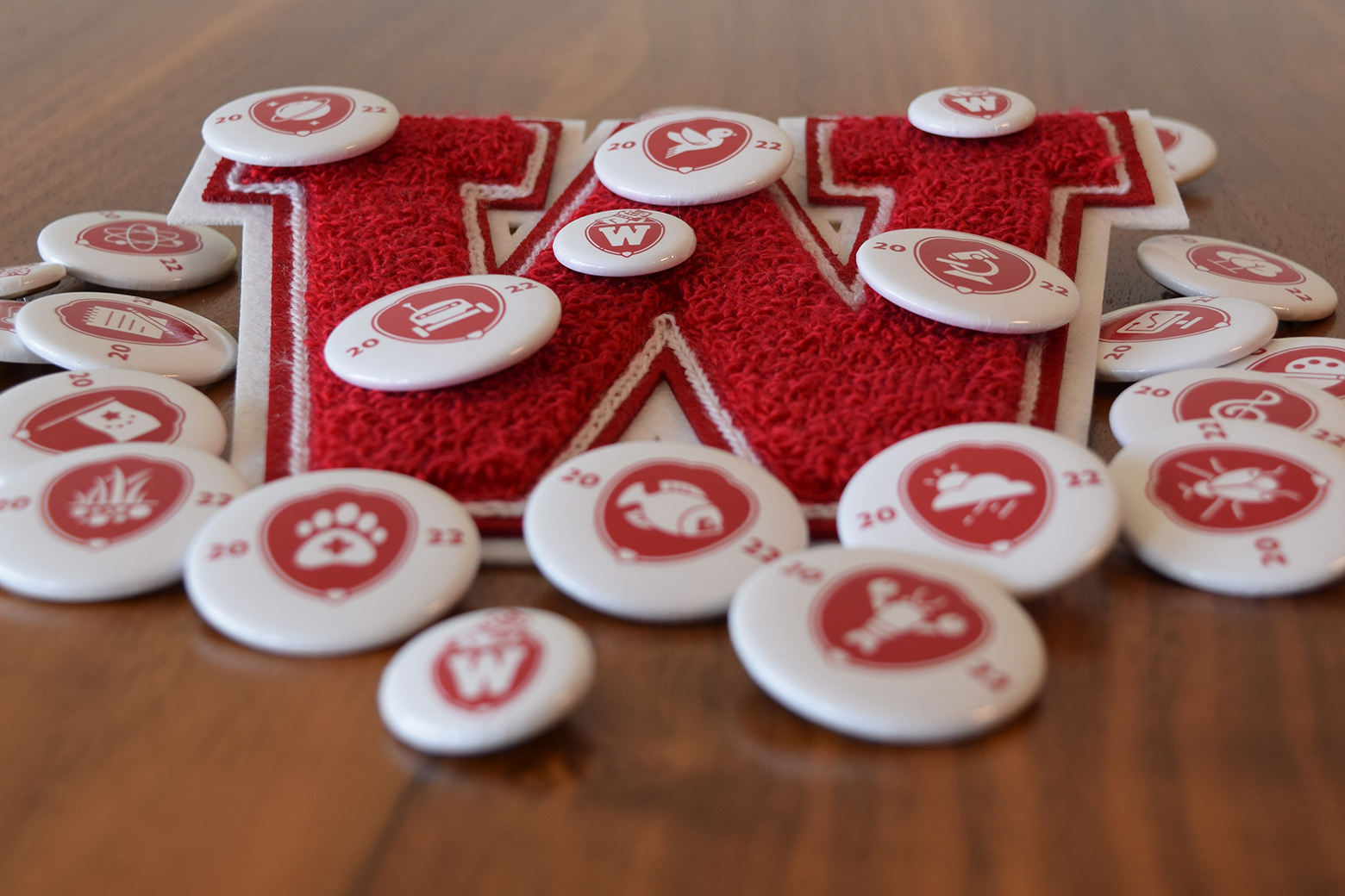
When I present my designs to stakeholders, I like to break them down into their components and then reassemble them. This approach keeps people engaged, educates them about design, and encourages a discussion focused on communication priorities. I drew inspiration from the UW Crest and WAA’s Well Red Bucky sculpture for the GPU rebranding. I transformed the traditional crest into a friendly, rounded form and incorporated an illustration of the Well Red Bucky head, WAA’s diagonal motif, and athletic “W” letterform. I used WAA’s brand fonts, Mrs. Eaves and Verlag, for the wordmarks. I collaborated with my design colleague to redesign the major icons, giving them a thicker line weight and simplified, bolder shapes that match the Well Red Bucky illustration.
T-SHIRTS
Each year’s T-shirt design reflects the spirit of UW and becomes a favorite keepsake for participants.
NUMEN LUMEN T-SHIRT
The 2022 T-shirt design is inspired by the Numen Lumen symbol of UW–Madison, featured on various university structures. Icons representing each major are included to ensure all participants’ majors are featured.
MAP T-SHIRT
In 2022, I created a map design for the T-shirt. After a year of virtual events due to the pandemic, I wanted to create a design to welcome participants back to UW. The map illustration combined major icons with iconic buildings on campus. The team loved the idea and eventually selected it for the 2023 T-shirt. It was enjoyable to see participants searching for the icon representing their major on the map.
UNIVERSE T-SHIRT
The crest’s shape, with a point at the bottom, reminds me of a spinning top or, in this design, a spinning planet with the major icons orbiting around it. This option was popular with the team and may take on a 3D form in future years.
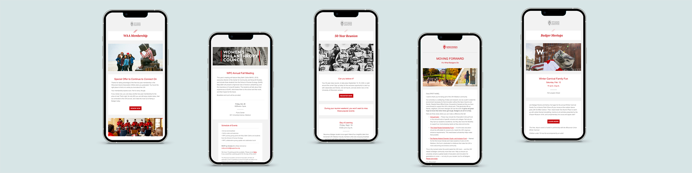
EMAILS
Designed a series of emails to guide WAA members through registration, major selection, and event details for Grandparents University.
EMAIL JOURNEY
Below are two emails from an email journey that will assist WAA members in registering for Grandparents University (GPU). GPU is a popular program that usually sells out within the first hour of registration. The emails provide a detailed explanation of the registration process and guide participants on how to choose their majors and field trips.
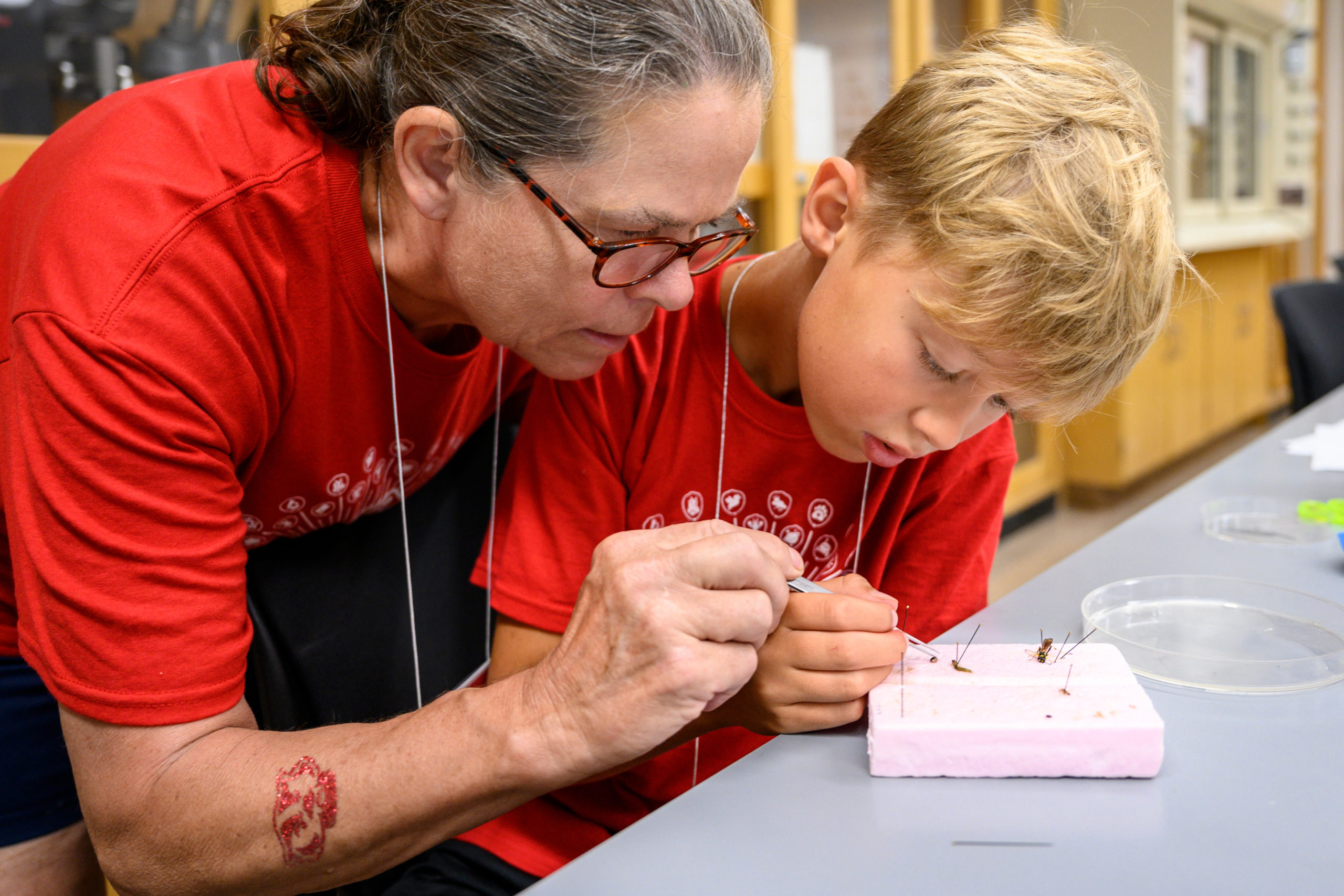
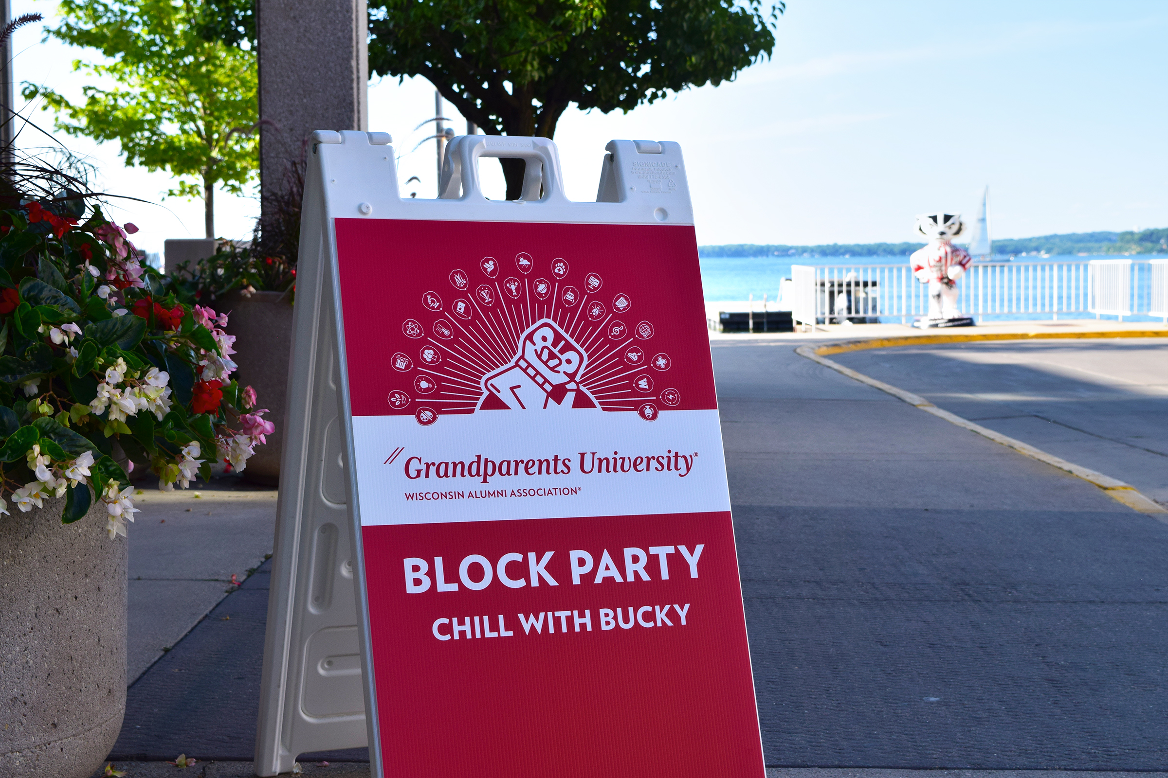
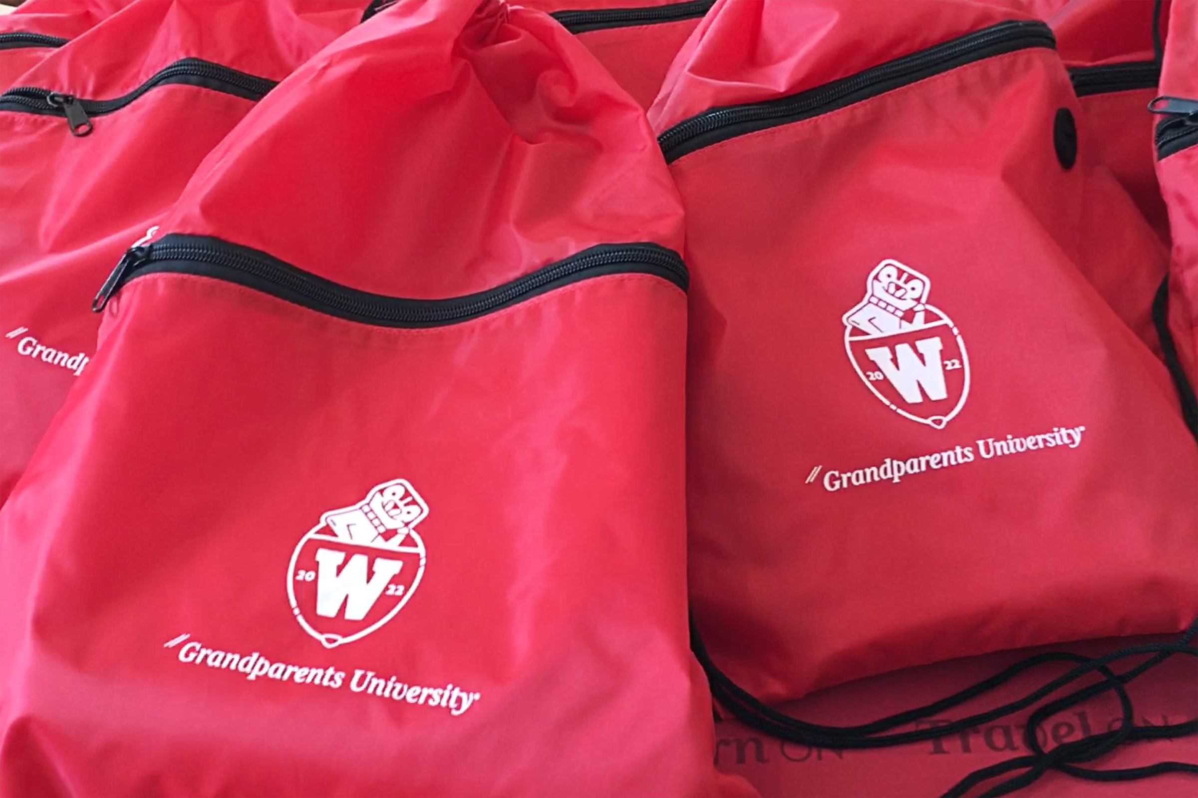
EVENT DESIGN
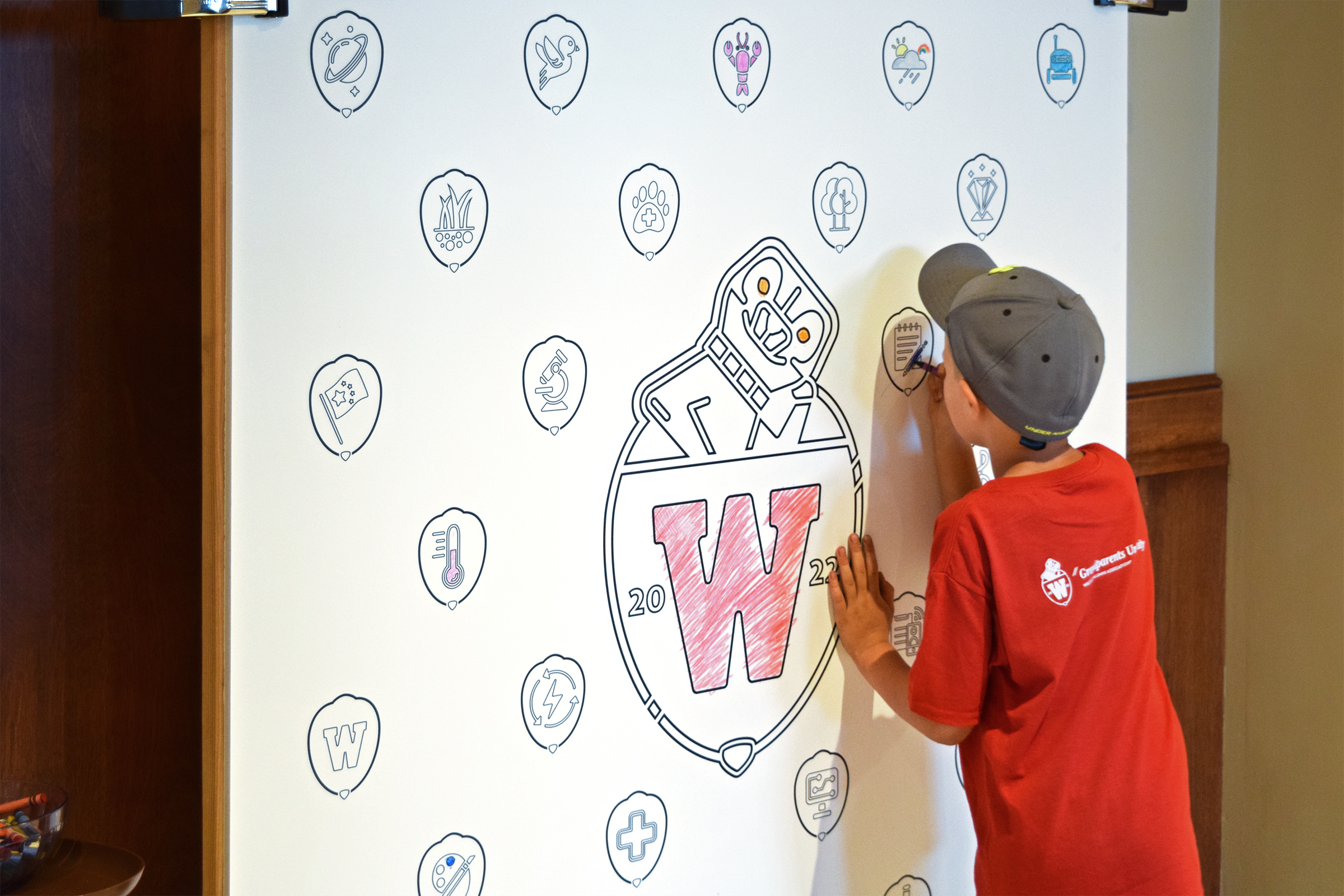
Enhanced the event experience with cohesive branding across the program book, clear signage, keepsake merchandise, and interactive elements like a mural-size coloring board for participants to enjoy.
PROGRAM BOOK
We redesigned the program book to guide our members through the event’s activities. This involved updating the branding, reorganizing information to make the schedule easier to understand, simplifying the map to highlight key landmarks, and adding playful icons throughout the program.
EVENT GRAPHICS AND SWAG
We successfully implemented the new branding across the event collateral, signage, and swag. Select materials feature the current year’s t-shirt design, while others use the GPU logo, making them timeless and reducing the workload from year to year. I enjoyed creating a mural-size coloring board with the new brand and watching the participants color in their majors and the logo.
Testimonials
I enjoyed working with Lynn and will miss her 650 office visits! Her thoughtfulness and intentionality were so palpable in her work on Grandparents University’s creative.
Lindsay R., Program Manager, WFAA
I remember being blown away by the creativity of Lynn’s Grandparents University designs, including last year’s coloring posters for kids! And always appreciated her presence as a volunteer at events!
Liz S., Senior Event Manager, WFAA
It has truly been so great working with Lynn on the Grandparents University team. Lynn has done so much for the program, and we appreciate her talents and enthusiasm for Grandparents University!