Creating visuals for community events that spark interest and excitement is a unique and rewarding experience. Observing the immediate response to my posters around town or graphics at events provides direct feedback on the impact of the event designs.
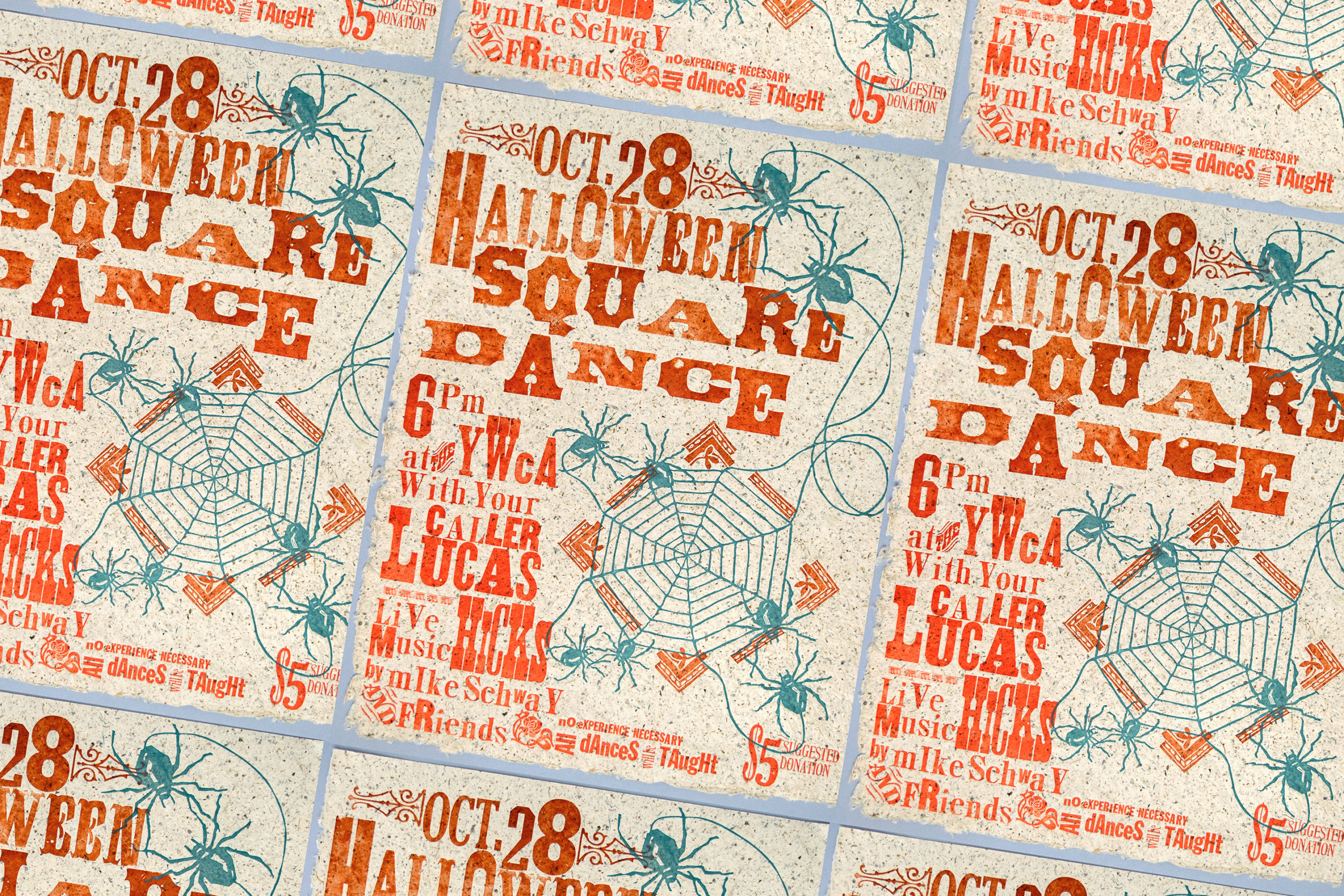
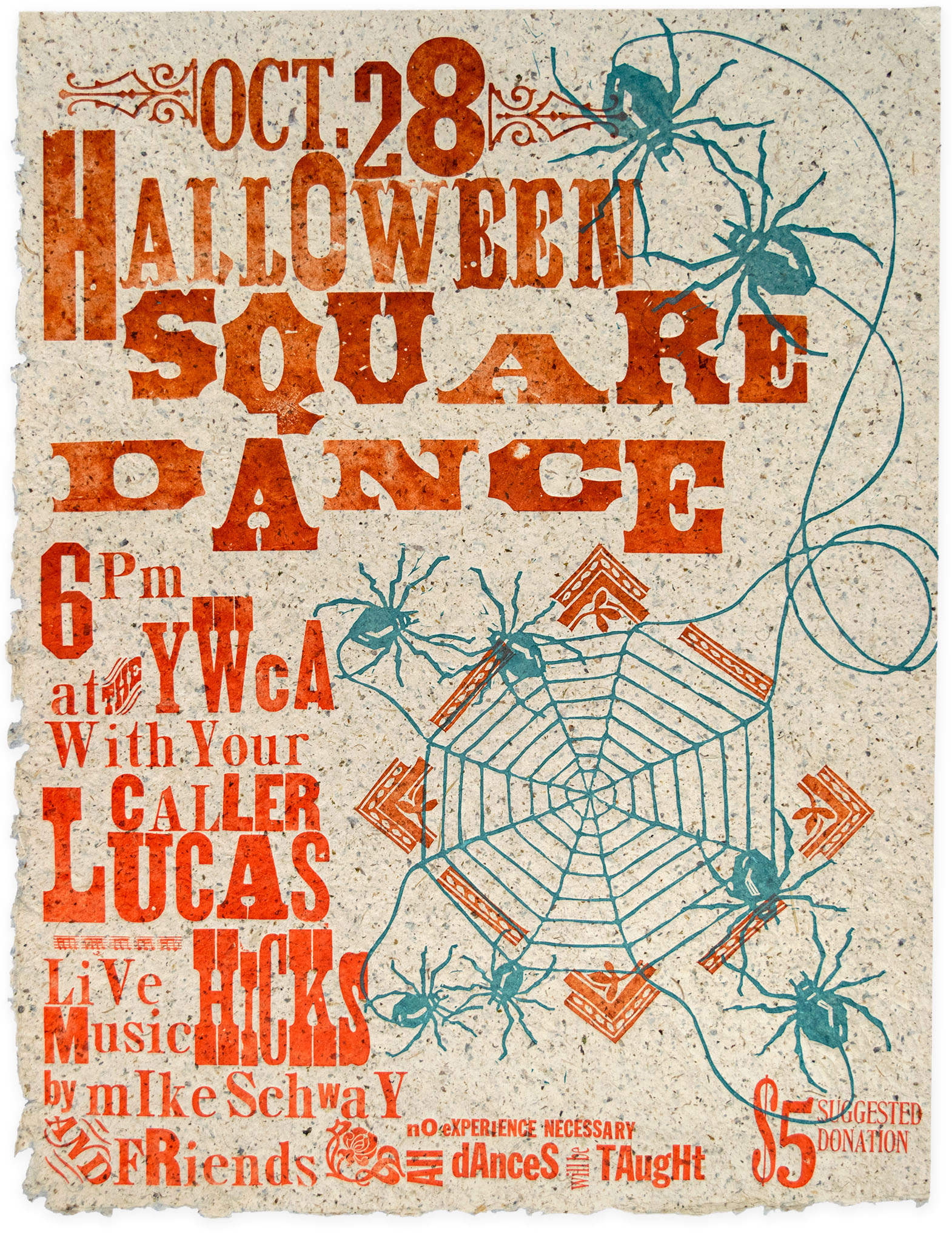
HALLOWEEN SQUARE DANCE
I designed a whimsical poster for the Halloween Square Dance hosted by a local square dance group in Bellingham, WA. The poster features an illustration of spooky Halloween spiders square dancing, created with a linocut technique. To add a unique charm to the design, I selected typography and border motifs from various wood types available at Bison Bookbinding and Letterpress, arranging each element by hand.
The printing process required two passes through the platen press. For the first pass, I used inks to create a gradient from rust to bright orange. In the second pass, I applied teal blue ink to highlight the dancing spiders and web. I printed the posters on handmade paper from the shop to preserve their natural, deckle edges, which enhanced the overall tactile quality of the piece. This project was a fun and engaging experience, blending traditional printing techniques with a touch of Halloween humor.
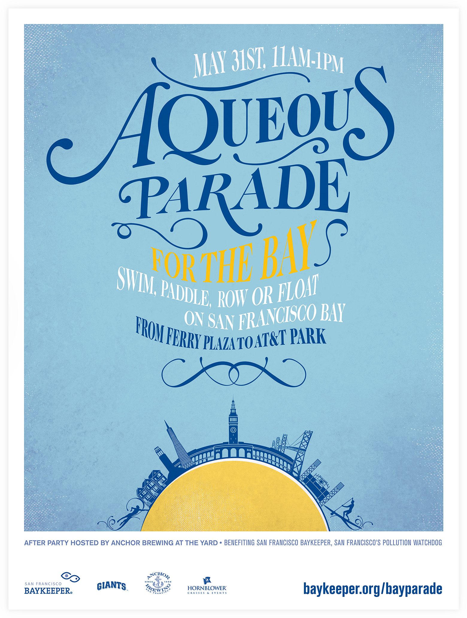
AQUEOUS PARADE FOR THE BAY
I designed a vibrant poster to promote the Aqueous Parade for the Bay, a fundraiser supporting the San Francisco Baykeeper’s conservation and restoration efforts. This unique event invites participants to engage with the Bay by swimming, paddling, rowing, or floating from the Ferry Plaza to AT&T Park.
A primary challenge was depicting water in a way that enhanced rather than obscured essential information. To tackle this, I stylized the typography to evoke flowing water, using curved letterforms and undulating lines that mimic the movement of water. Inspired by my client’s appreciation for vintage circus posters, the design includes an aged blue background and a radiant sun that highlights the parade’s path through the water.
This project blends traditional design elements with innovative lettering to produce a poster that not only captures the event’s spirit but also effectively communicates its message.
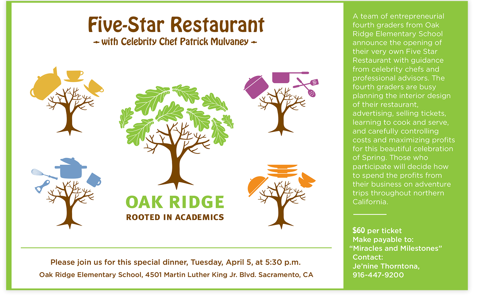
OAK RIDGE BENEFIT
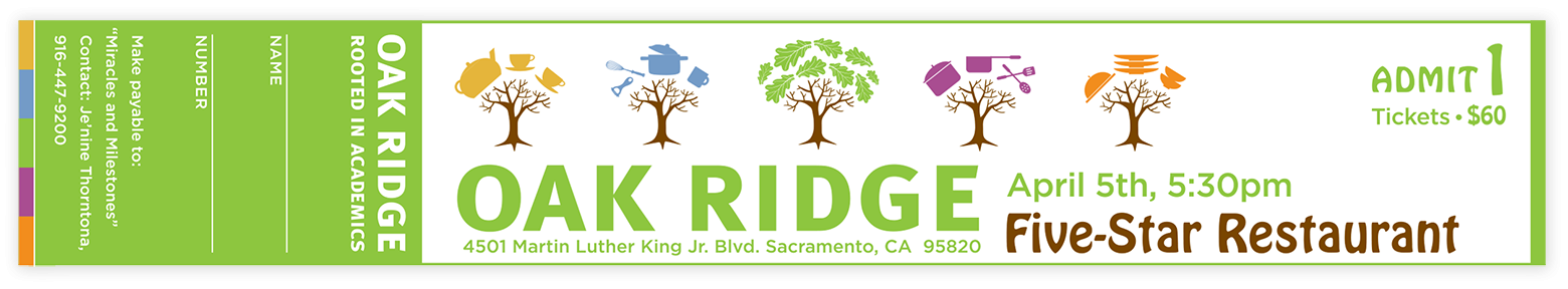
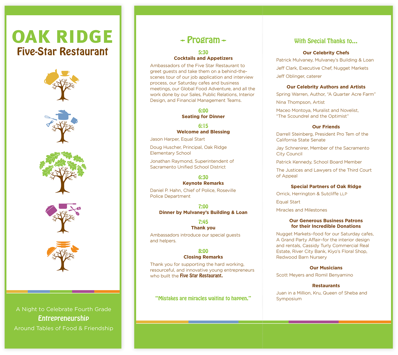
For the Oak Ridge Elementary School’s benefit dinner featuring students and celebrity chef Patrick Mulvaney, I designed a series of event graphics that captured the essence of the culinary celebration. Adapting the school’s vibrant branding, I modified the existing logo, replacing the tree leaves with icons of kitchen cookware to symbolize the students’ culinary learning experience. This playful adjustment underscored the event’s theme. It ensured a cohesive visual identity by integrating the established logo and color palette across all materials—including invitations, tickets, programs, menus, and name tags. This design strategy reinforced the school’s community spirit and its educational mission.
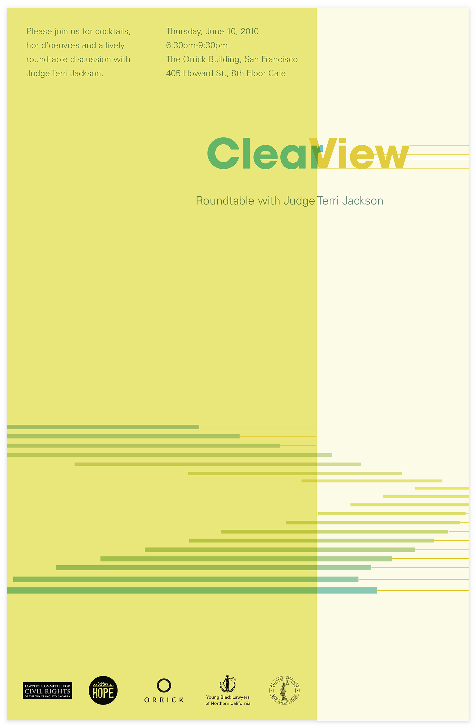
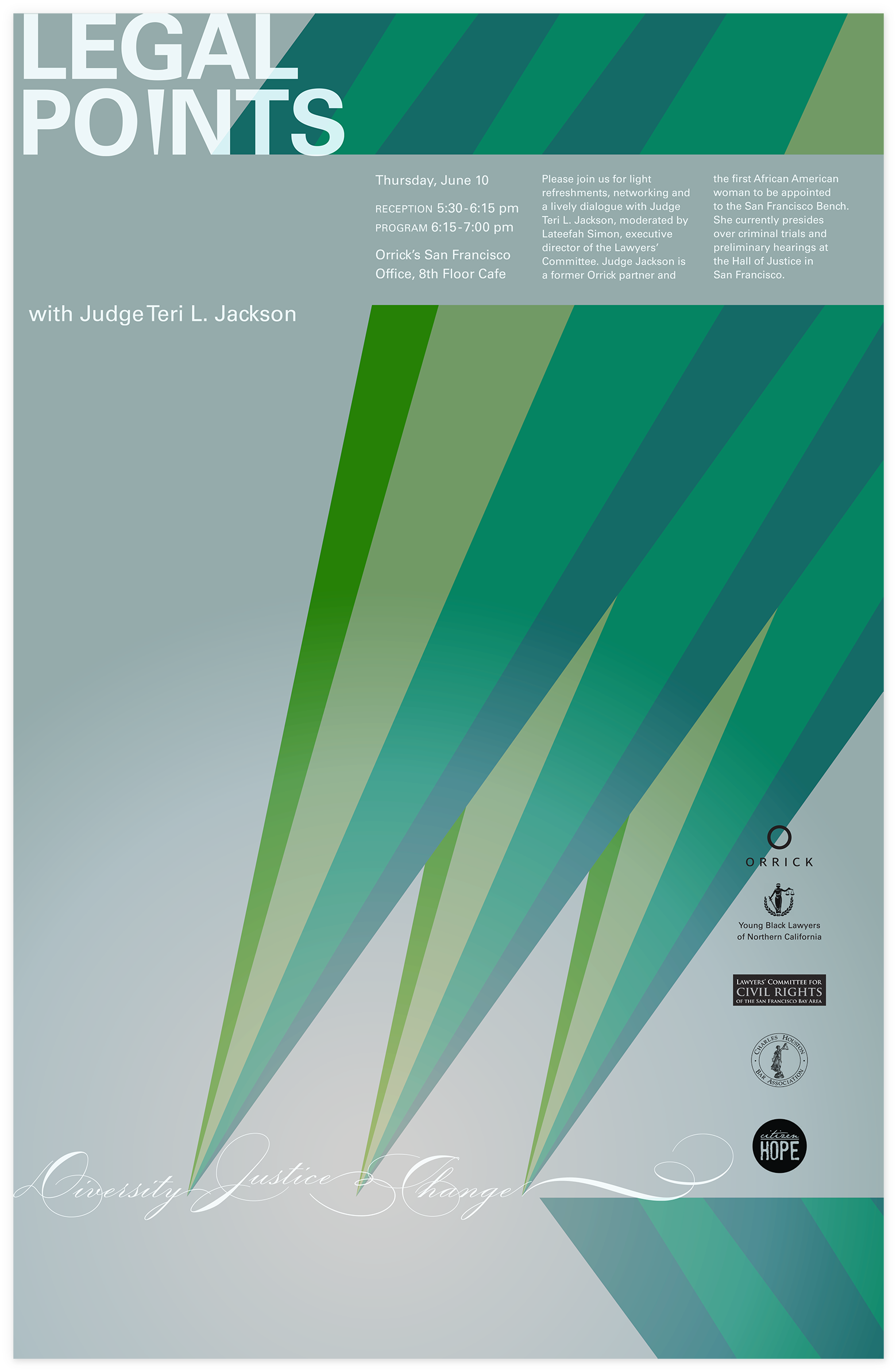
LEGAL POINTS DISCUSSION
For a pivotal discussion event co-hosted by the law firm Orrick, I developed two distinct event names and corresponding poster designs, with ‘Legal Points’ being the chosen name. My approach involved using graphic lines to distinctly capture each concept. For the ‘Clear View’ option, calm, horizontal lines evoked a serene landscape and horizon, reflecting the name’s implication of clarity and openness.
In contrast, the selected ‘Legal Points’ design adopted a more dynamic approach with colorful, bold lines converging into points symbolically representing pens. This design effectively communicated the event’s key themes of diversity, justice, and change, creating a vibrant and thought-provoking aesthetic that captured the essence and objectives of the discussion.
BIRTHDAY GAMES
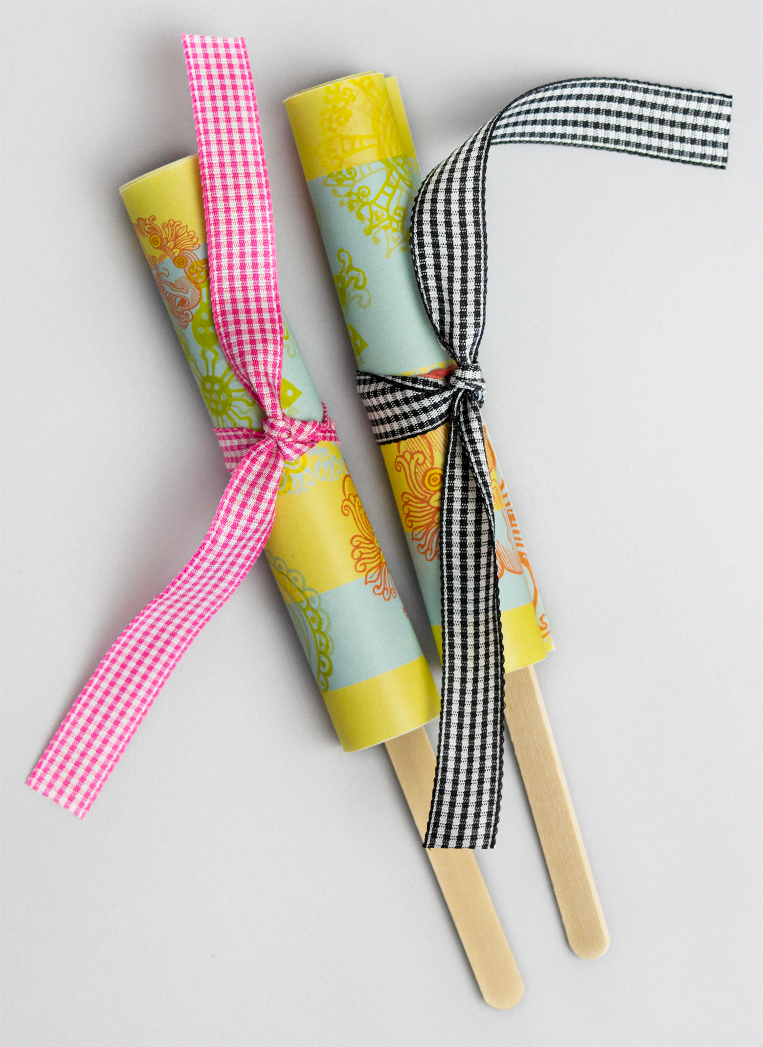
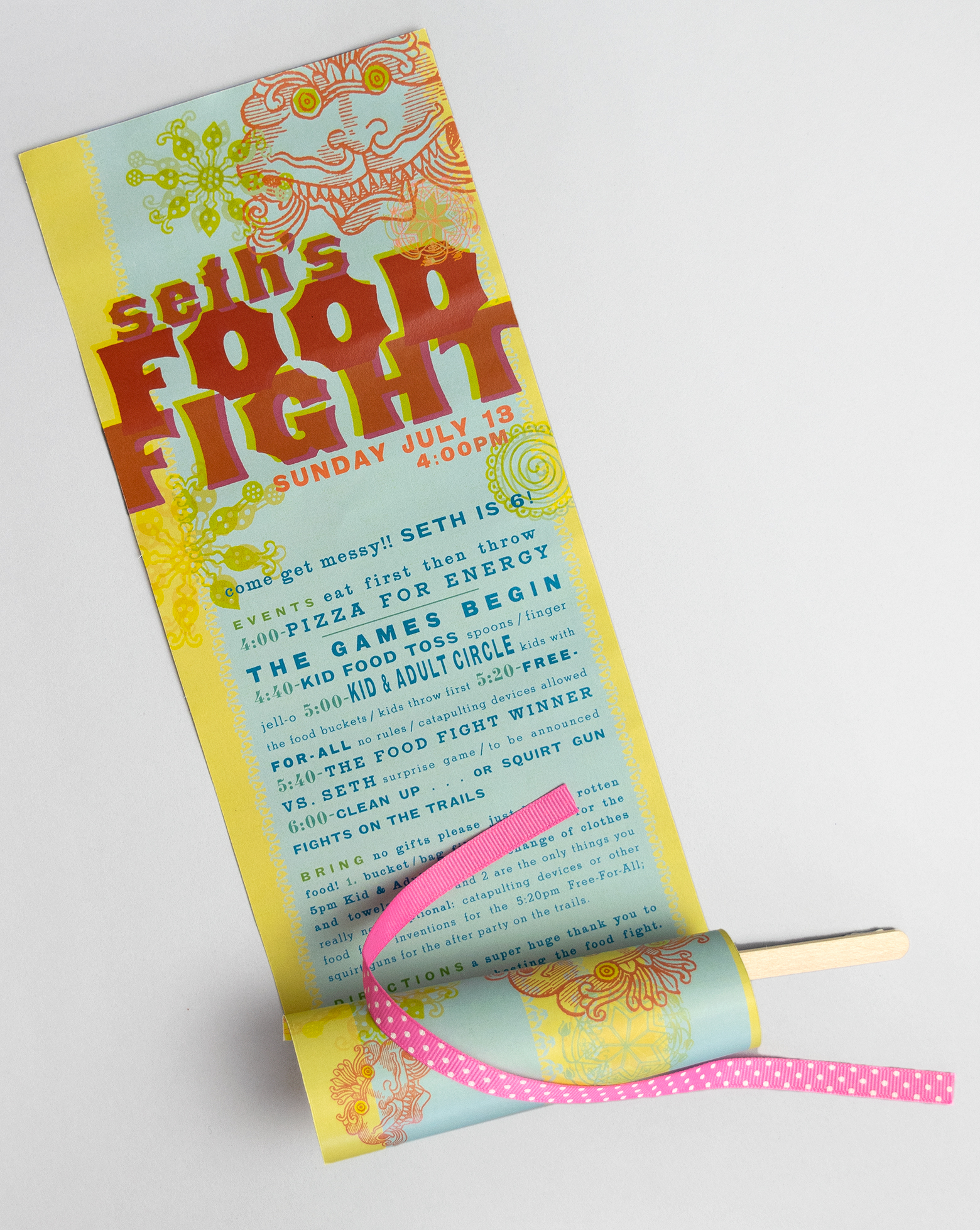
For my son Seth’s 6th birthday, I moved away from the usual digital invitations and created a unique, tactile invitation experience instead. Drawing inspiration from objects kids enjoy, I designed rolled-up invites mounted on popsicle sticks, playfully resembling a popsicle and a paper yo-yo that unfurls into a scroll. This personal touch was enhanced by hand-delivering each invite.
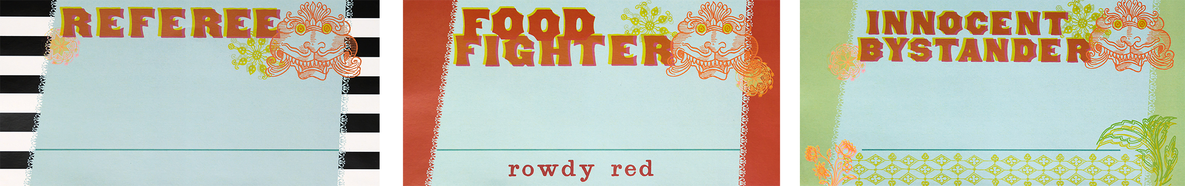
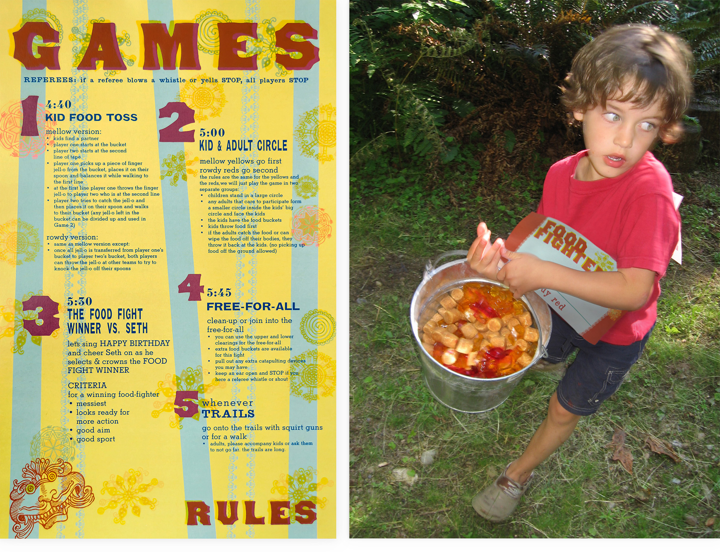
The party theme was a food fight, and the event materials were designed to reflect this lively theme. The invitations and event graphics showed whimsical motifs flying through the air and a lion ready to join the feast, bringing humor and excitement into every element. During the event, each child wore a bib designating their roles in the games, enhancing the immersive experience.
This event stands out as one of our most memorable themed parties. It is beloved for its creativity and the joy it delivered from the first invitation to the last game.
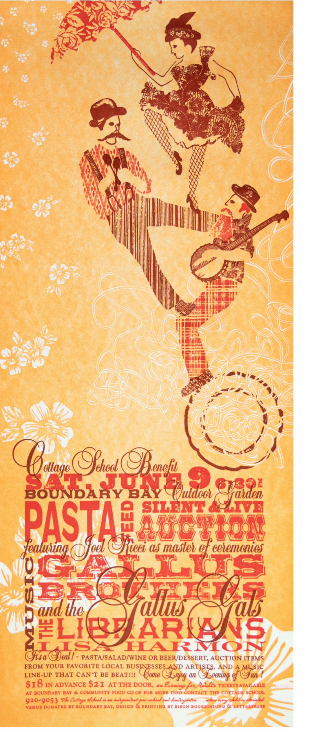
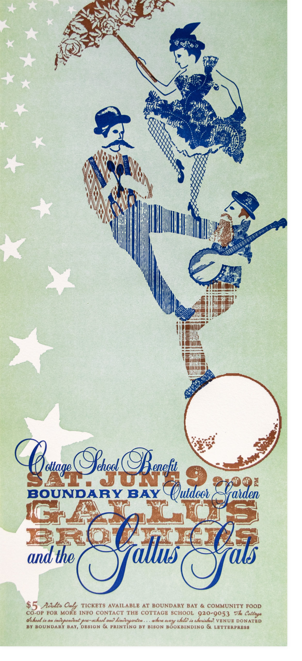
The COTTAGE SCHOOL BENEFIT
I designed two posters for The Cottage School’s benefit event, featuring the old-time music duo, the Gallus Brothers. The first poster, in bright orange, captured the early evening ambiance with images of flowers and the Gallus Brothers whimsically standing on a plate of pasta, highlighting the dinner and auction. In cool blue, the second poster featured the Brothers on a moon against a starry background, perfect for the late-night performance.
I used vintage fabric scans to add texture to both designs and letterpress printing on a platen press to accentuate the old-time aesthetic. This approach complemented the theme and turned the posters into sought-after keepsakes, quickly taken from local displays.